
A beginner’s guide to creating fluorescence bioimages for scientific publication
Creating visually appealing, understandable and scientifically accurate image-based figures can be challenging. Given the breadth of options available in microscope systems, image analysis and visualisation platforms, and graphic design software, the number of choices can be overwhelming and succinct start-to-finish tutorials hard to find. A recent survey revealed that the quality of reporting of image capturing and processing methodologies is unacceptably low in biomedical research articles, where key information and details are largely absent. This is cause for concern given that post-processing image manipulation needs to be done in a manner that ensures authenticity and does not misrepresent the underlying image data.
The methods I describe below were taught to me by several excellent researchers. However, these methods are by no means all-encompassing and are certainly not the only correct way of editing images for publication or presentation. Furthermore, this post was primarily written to assist new students in our own lab, and is therefore largely tailored to our own setup and systems. I want to stress that there are many many ways to skin this cat, as is the case for just about everything in science.
With that out of the way, let’s get started!
Requirements
ImageJ or Fiji. I prefer the added plugins that come pre-installed with Fiji, download the latest version from: https://imagej.net/software/fiji/downloads
Adobe Illustrator or any other vector graphics editor
A raw image viewing software is optional. Our lab primarily uses Nikon microscope systems, therefore, we use NIS-Elements Viewer to quickly scan through images. You can find it here: https://www.microscope.healthcare.nikon.com/products/software/nis-elements/viewer
Optional: Try our Multiwell Plate Experiment Designer for easily planning and generating multiwell experiments, and our Colour Palette Generator for creating visually striking, informative and colour-blind friendly palettes using colour theory.
1. Making a plan
After planning, conducting and analysing your beautiful imaging experiments (see our Multiwell Plate Experiment Designer for help with experiment design), take some time to consider the final composition of your figure panel before proceeding further. What is it that you want to show and how many images are required to achieve this? How many channels do your images consist of, and do you need to show all of them to convey your message or finding? It’s great practice to sketch out a draft figure panel before you start. In this tutorial, we’ll be creating a basic figure comparing the expression of key proteins during cancer cell mitosis. For this, we’ll start with a simple plan, shown here:

2. Image selection
Using a Nikon microscope, we export our image datasets as .nd2 files. I prefer to open these in NIS-Elements to peruse my images, as it’s fast and easy to scroll through large sets. Find the images to display in the figure and take note of the corresponding metadata found along the upper blue bar of each one. In this case, we can identify the images using the XY image number.

3. Image processing
To make raw images more visually appealing and clear for presentation, you can edit them using ImageJ. In ImageJ, open or drag in the raw file, click “OK” in the Bio-Formats Importer and select the chosen images by ticking the “Series” numbers that match the XY numbers of our chosen images.

Currently, the two images are in what’s called an image stack (below, left), where the individual channels are displayed as separate slices that can be navigated by scrolling along the horizontal channel (c) bar at the bottom of each window. To see all of the channels together, select Image -> Color -> Make Composite to convert the image stack into a composite image (below, right). Now, the channels remain separated but can be displayed together to create an overlay image by selecting them in the Channels Tool (Ctrl+Shift+Z) window.

The next thing we want to do is make a crop of the particular cells or part of our images that we’d like to show. Cropping is often necessary to show close details like intracellular structure or cut out any erroneous parts of the image. This is especially important when working with large-format montage images like the ones shown. It’s generally best to use the same crop size for all images in a figure panel to ensure you maintain the scale of cells you are comparing.
To make a crop of a particular region of interest (ROI), open the ROI Manager using Analyze -> Tools -> ROI Manager or the shortcut “t”. The ROI Manager allows you to work with multiple selections from different parts of a single image or multiple images. Using the rectangle selection tool, create a box around the area you’d like to crop, then click Add or press “t” again to add that selection to the manager. Then select your image on the right and add a same sized selection by clicking the newly saved ROI in the manager. You can then reposition this selection to the area of interest in the second image. Renaming and saving your ROIs for future use can be handy for ensuring similarly sized images throughout a figure or article.

To make a crop of each image, click the selection then duplicate that region using Image -> Duplicate (Ctrl+Shift+D). Nice!

These images look okay, but you can improve their visibility by scaling the intensities of each channel. This is an important step to do correctly, as artificially altering the intensity of images can lead to misrepresentation and malpractice.
First, open up the Channels Tool (Ctrl+Shift+Z) and the Brightness/Contrast panel (Ctrl+Shift+C). Adjust the intensities of each channel in a step-wise fashion. Using the Channels Tool, select the Grayscale option to view individual channels in black and white. Looking side-by-side at these two images, we can clearly see the mitotic cells on the right express much higher intensity in this channel. You can confirm this by observing the intensity histograms of each image in the B&C panel. As the intensity is higher in the image on the right, we’ll start by scaling this one.
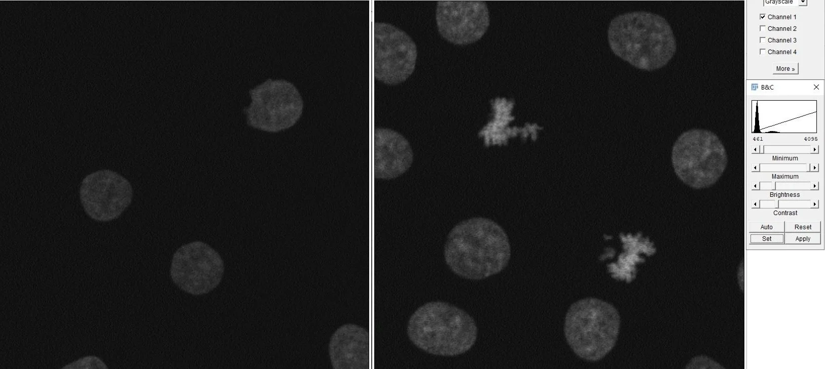
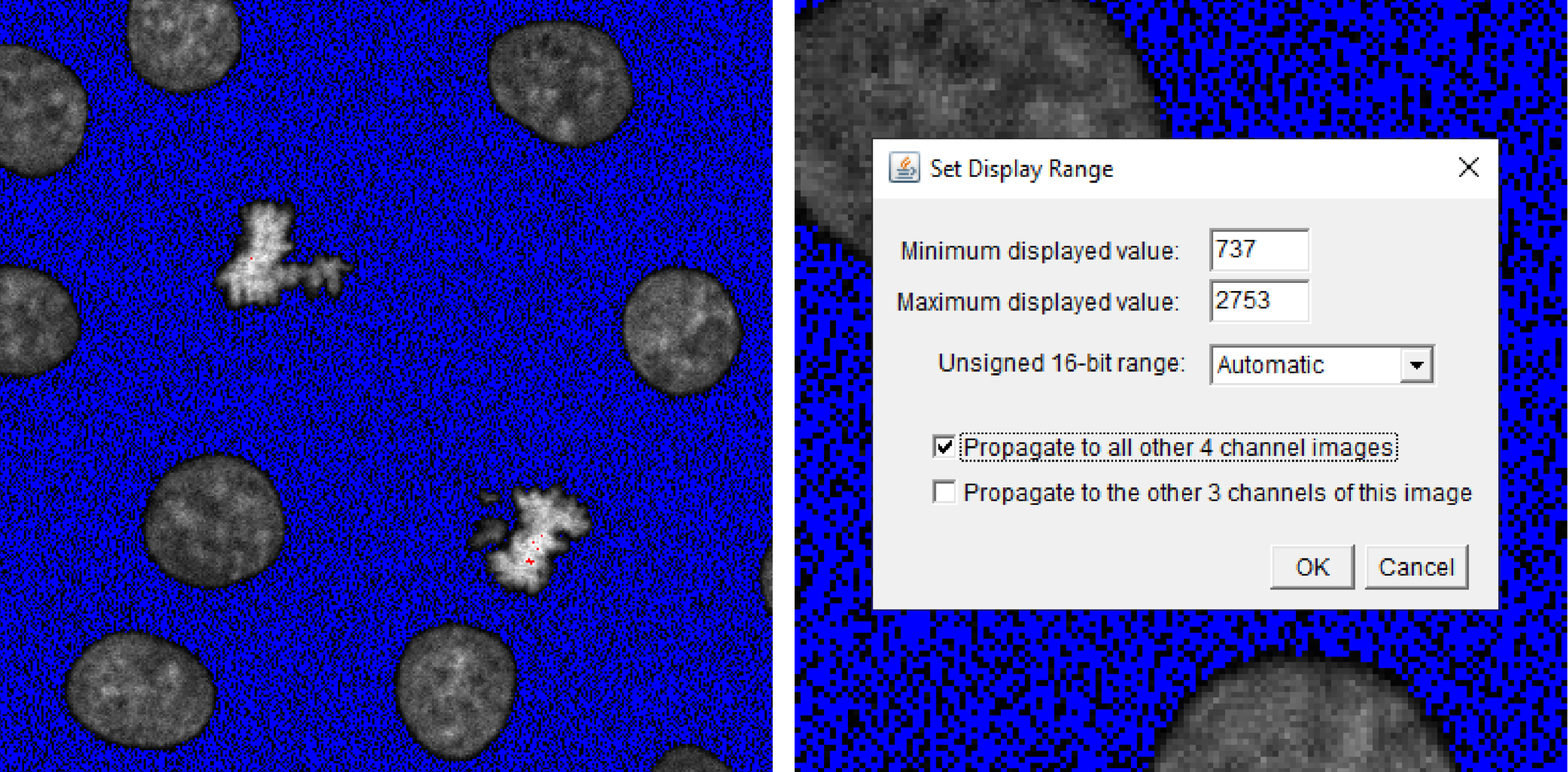
Select the first image and assign the HiLo look-up table (LUT) from the LUT Menu on the toolbar. LUTs facilitate visualisation by transforming intensity values into an array or map of colours. The HiLo LUT allows us to detect saturated (red) or clipped (blue) pixels while you scale the maximum and minimum intensity values using the B&C panel. Adjust the sliders to remove background noise and increase the signal intensity without misrepresenting the image by extending too far beyond the captured data. Once satisfied, click Set and Propagate to all other 4 channel images to apply the same scaling to your second image, thus maintaining the correct/proportional intensity relationships between the two images.
Repeat these steps for the other 3 channels of your image. Once completed, your two images are proportionally scaled for visualisation purposes and appear as below.
As a final step, add a scale bar to your images using the underlying metadata read by ImageJ. I like to first duplicate one of my images then add the scalebar to that image using Analyze -> Tools -> Scale Bar. I’ll explain why we do this shortly. Ensure the scale bar is an appropriate width on the image by adjusting the Width in microns to a reasonable setting.
At this point, you can save these scaled images using File -> Save As. Using Save As is a good habit for ImageJ, as it ensures you never accidentally save over any raw files that may be used for later analysis.


A note on colour
In most fluorescence microscopy, images are captured in grayscale. As we’ve seen in ImageJ, pseudocolour can be added to these images using LUTs - this was done automatically when we produced our composite image. A researcher’s choice of colour when presenting fluorescence imagery is entirely a matter of preference. However, it is well understood that the human eye perceives colour information in a non-linear fashion. We are more sensitive to colours in the yellow range and have decreased sensitivity in the blue range. This is why purples and blues are harder to see in comparison to yellows and greens of the same luminance. To circumvent these hardwired biases, single-channel fluorescence images should always be shown in grayscale.
This is not to say that coloured images are never useful, however. For example, colocalisation studies are often facilitated by multi-channel overlay images, where analogous colours like red and green are chosen to highlight areas of overlap, appearing yellow. In these cases, single-channel grayscale images should be displayed alongside the merged images.
Lastly, presenting grayscale images avoid issues relating to colourblindness. Where colour is required, careful consideration should be taken and red-green alternatives like cyan-magenta are preferable. Finding a colourblind-safe palette becomes increasingly difficult with multi-channel images of 3 or more, therefore, the inclusion of separated grayscale images is again preferable. To help generate such palettes, try our Colour Palette Generator which allows you to create striking new colour palettes or includes several colourblind-safe and perceptually uniform options easily that can be easily ported into Illustrator in our final step.
With that in mind, we can now begin to piece together our final figure using Adobe Illustrator.
4. Figure preparation
To ensure the highest quality, we’ll copy our images directly from ImageJ into Illustrator. Select the first channel using the Grayscale option in the Channels Tool, then select Edit -> Copy to System and paste it into your Illustrator document. Repeat this process for all the individual channels you would like to show, as well as the merged colour images and the image containing the scale bar. You can then align, group and resize all the images using the Align and Distribute tools (Shift+F7).


Next, I overlay the scale bar image on top of my first single-channel image, zoom in and trace its exact length using the line tool. I then delete the overlayed image, leaving only the new scale bar line and add the length and units using the Text tool. This ensures the scale bar is now added as a vector graphic that can be grouped to the images and enlarged or made smaller without loss of quality. Given that all images have been resized together and are thus the same size, you can then add this scale bar to the other images as you please.

Finally, add marker labels corresponding to the colours shown in the merged image and category labels to delineate the two sets of images. You can easily copy and add the corresponding Hex codes from the Colour Palette Generator using the Color Picker tool. You can also add coloured arrows to point out areas of interest that you’d like to reference in the text. Here’s the completed figure panel, ready for publication!

Much credit goes to the researchers that showed me the ImageJ ropes, particularly Dr Laura Rangel, whose teachings I now use daily.
Follow me on Twitter, Instagram, or LinkedIn to keep up with my science and all future imaging-related escapades.
Further reading
An article by Jayme Johnson discussing the strengths and weaknesses of image manipulation software: 10.1091/mbc.E11-09-0824
An article by Helena Jambor et al. who comprehensively assess and provide solutions to the common pitfalls associated with image publication: 10.1371/journal.pbio.3001161
The ImageJ user guide: https://imagej.nih.gov/ij/docs/guide/146.html